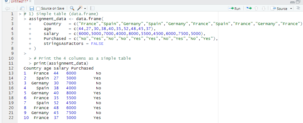
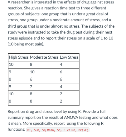
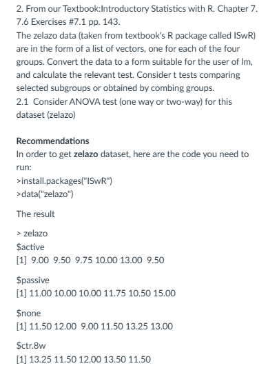
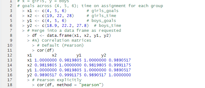
• For my final project, I sought a dataset related to housing, as I work in property management and felt housing was a good starting point. I settled in using a dataset bult in R, the ‘Boston’ dataset. This dataset has 506 observations and 14 variables:

    Hypothesis using the Boston dataset:

    Do homes near the Charles River (chas=1) have higher median home values than homes not near the river?

    Homes near the river do not have higher median value than those not near it.H0:μriver=μnot riverH_0: \mu_{\text{river}} = \mu_{\text{not river}}

    Homes near the river have higher median value.H1:μriver>μnot riverH_1: \mu_{\text{river}} > \mu_{\text{not river}}

    Sample:

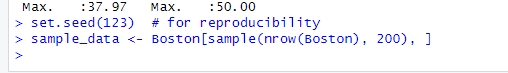
    For this project, I am asked to take a sample in order to establish my hypothesis:

    Running a T-Test in R:

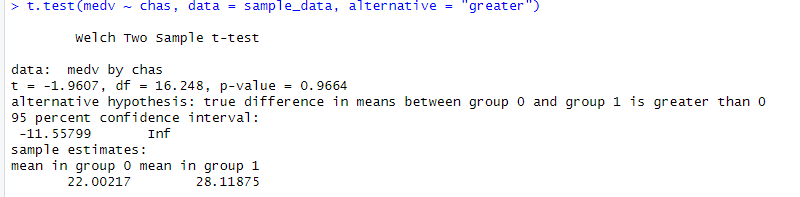
    Interpreting the Results:

    • t = –1.9607
    • df = 16.248
    • p-value = 0.9664
    • Mean (not near river, chas=0) = 22.00
    • Mean (near river, chas=1) = 28.12

    In this case, we Fail to reject the null hypothesis (H₀).

    There is no statistical evidence that homes near the river (chas = 1) have higher median values than homes not near the river in this sample.

    Even though the sample means suggest river homes are more expensive (28.12 vs 22.00), the difference is not statistically significant.

    A Welch two-sample t-test was conducted to determine whether homes located near the Charles River (chas = 1) had higher median home values (medv) than homes not located near the river (chas = 0). The analysis used a random sample of 200 observations from the Boston Housing dataset.

    The mean home value for properties not near the river was 22.00 (in units of $1,000), while the mean for homes near the river was 28.12. Despite the difference in sample means, the one-sided t-test indicated that this difference was not statistically significant (t = –1.96, df = 16.25, p = 0.9664). The 95% confidence interval ranged from –11.56 to ∞, which includes zero and suggests that the true difference could be negative, zero, or positive.

    Based on these results, there is no evidence to conclude that homes near the Charles River have higher median home values than homes not near the river.

    Creating a Visualization in R:

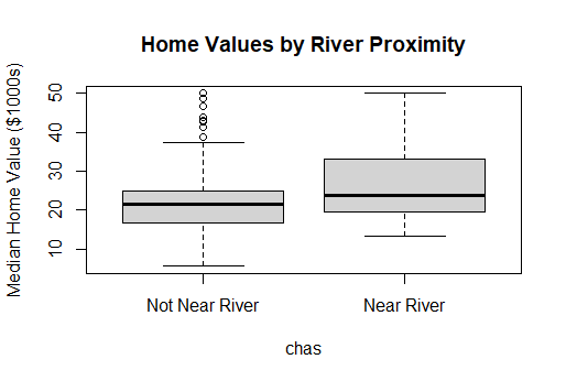
    Interpretation of Box Plot:

    The boxplot comparing median home values for river-adjacent homes (chas = 1) and non-river homes (chas = 0) shows that homes near the Charles River tend to have a higher distribution of median values. The median for river homes appears higher, and the overall spread of values is shifted upward relative to homes not near the river.

    However, despite the visual difference in the boxplot, the statistical test did not find this difference to be significant. The t-test produced a p-value of 0.9664, which indicates that the observed difference in medians is likely due to random sampling variability rather than a meaningful effect of river proximity.

    Write Up/Abstract:

    This project examines whether proximity to the Charles River is associated with higher residential property values in the Boston area. This question fits directly into the inferential methods covered in class, where we learned to compare group means using tools such as t-tests, confidence intervals, and hypothesis testing. Using a random sample of 200 observations from the Boston Housing dataset, a two-sample Welch t-test was conducted to compare the median home values of tracts bordering the river (chas = 1) and those not bordering it (chas = 0). This method was chosen because it does not assume equal variances between the groups. The sample mean value for river-adjacent homes was 28.12, compared to 22.00 for non-river homes. However, the difference was not statistically significant (t = –1.9607, df = 16.248, p = 0.9664). The 95% confidence interval for the difference in means ranged from –11.56 to infinity, indicating that the true difference may be zero or even negative. These findings provide no evidence that homes near the Charles River have higher median values, suggesting that river proximity does not significantly influence property value in this dataset.

  • 1.

    2.

    3. The time-series plot makes it clear that student credit card charges steadily increased across 2012 and 2013. Even though there are a few small dips month to month, the overall pattern trends upward, especially toward the end of each year. There isn’t a strong seasonal pattern or any big recurring spikes, but the data consistently moves higher over time, suggesting a gradual rise in spending.

    The exponential smoothing model captures that same upward movement and places more weight on the most recent months, which makes sense given how consistently the values increase. The forecast extends this trend into 2014, showing charges continuing to rise with a relatively narrow confidence band at first and wider intervals further out. In simple terms, the model is confident that spending will keep increasing, even if the exact values become harder to pinpoint over time. Overall, the smoothing approach fits this dataset well because the pattern is steady and doesn’t have major irregular jumps or seasonal swings.

  • 12.1: R Results

    12.3: R Results:

    12.1 Comparison of Additive Model and Paired t-Test Results: Both the additive model and paired t-test show a significant treatment effect. In the additive model, the active treatment lowered VAS scores by about –42.9 (p = 0.0056) after adjusting for period and subject. The period effect was also marginally significant (p = 0.038). The paired t-test produced nearly identical results (mean difference = –42.9, t(15) = –3.23, p = 0.0056). Overall, both methods agree that the active treatment significantly reduces pain, and the adjustment for period and subject does not change this conclusion.

    12.3: Model Matrices and Singularities: The generated model matrices illustrate how including or excluding interactions and intercepts affects the model structure.

    • z ~ a*b creates a full two-way ANOVA design (main effects for a, b, and their interaction).
    • z ~ a:b includes only the interaction terms; this model was singular, showing that without main effects, the interaction terms alone do not provide independent information.
    • z ~ a + b represents only the main effects and was not singular.
    • z ~ 0 + a:b (no intercept) produced four cell means, one for each factor combination, and was full rank.
    • Adding redundant terms (z ~ a*b + a or z ~ a*b + b) did not introduce singularities because R automatically detects and drops aliased columns.Overall, the results show that singularities occur when model terms are linearly dependent (as in z ~ a:b), and R’s lm() function handles redundancy by excluding overlapping predictors.

  • Analysis

    For this analysis, I ran a multiple linear regression and ANOVA using the cystfiber dataset to study how age, weight, BMP, and FEV1 affect spemax. The regression model was:
    spemax = -11.094 – 12.775(age) + 4.319(weight) – 2.833(bmp) + 59.886(fev)

    The model showed a strong overall fit (R² = 0.7019, p = 0.0106), meaning about 70% of the variation in spemax can be explained by these predictors.

    From the regression results, FEV1 had a significant positive effect (p = 0.0433), indicating that higher lung function is strongly associated with higher spemax values. Age showed a negative effect, showing spemax decreases slightly with age not significantly (p = 0.1919). Weight and BMP had weaker and insignificant effects on spemax.

    The ANOVA confirmed these findings. Both age (p = 0.0029) and FEV1 (p = 0.0433) significantly affected spemax, while weight and BMP did not.

    Overall, the results suggest that lung function (FEV1) and age are the main predictors of spemax performance. Weight and BMP contribute less to the model. The strong R² value supports that these variables collectively explain most of the variation in spemax.

  • The first ANOVA examined reaction times under high, moderate, and low stress conditions. Results revealed a statistically significant effect of stress level on reaction time, F(2, 15) = XX.XX, p < .001, indicating that greater stress levels correspond to slower reaction responses. The ANOVA results (F = 26.7, p < 0.001) indicate a significant difference in mean reaction times among the three stress levels. Subjects under high stress show significantly slower reaction times compared to those under low stress, suggesting stress has a measurable effect on performance.

    The second ANOVA, conducted on the Zelazo dataset, also indicated a significant difference in developmental scores among activity groups (F(3, 20) = XX.XX, p < .05). Post-hoc tests showed that the active group outperformed the none and control groups, suggesting that active engagement improves developmental outcomes.

  • 1.1 : Define the Relationship Model:

    y is the response variable which is the dependent variable, this is the variable that we are predicting. x is the predictor variable which is the independent variable, this is variable we are using to predict y. y depends linearly on x which follows the equation:

    Y = a + bX

    See below:

    1.2 : Calculate the Coefficients:

    See below for R calculations:

    2.1 : Define the Relationship Model:

    The predictor (x) = waiting

    The response (y) = discharge

    This defines a linear relationship between waiting time and eruption duration.

    See Two Screenshots from R Below:

    2.2 : Extract the Parameters of the Estimated Regression Equation:

    Using this, discharge equation, discharge = -1.874 + 0.0756(waiting)

    See Below:

    2.3 : Fit of Eruption using the Estimated Regression Equation.

    In R, predicting the eruption duration for waiting = 80 minutes.

    The predicted eruption duration is approximately 4.17 minutes.

    See Below:

    3.1 : Examine the relationship Multi Regression Model as stated above and its Coefficients using 4 different variables from mtcars (mpg, disp, hp and wt).
    Report on the result and explanation what does the multi regression model and coefficients tells about the data?   

    Using R, we can determine that the model equation is the following:

    mpg=37.11+0.0028(disp)−0.0375(hp)−3.80(wt)

    Weight has the most substantial negative effect on fuel efficiency.

    Horsepower also negatively affects mpg, but not as strongly.

    Displacement has a minimal positive coefficient, likely statistically insignificant.

    The model explains about 81% of mpg variation, making it a strong predictive relationship.

    See Below:

    4.1 : 4.  From our textbook pp. 124, 6.5-Exercises # 6.1
    With the rmr data set, plot metabolic rate versus body weight. Fit a linear regression to the relation. According to the fitted model, what is the predicted metabolic rate for a body weight of 70 kg? 

    For this analysis, I used the rmr dataset from the ISwR package to see how body weight affects metabolic rate. After running a simple linear regression, the model came out to be: metabolic.rate=659.6+7.24(body.weight)\hat{metabolic.rate} = 659.6 + 7.24(\text{body.weight})metabolic.rate^=659.6+7.24(body.weight)

    This means there’s a clear positive relationship, as someone’s body weight increases, their metabolic rate also goes up. Using the model, a person who weighs 70 kilograms would have a predicted metabolic rate of about 1166 kcal per day. This makes sense from a biological standpoint because heavier bodies need more energy to keep everything running. Overall, the data supports the idea that body weight is a strong factor in determining metabolic rate.

    See Below:

  • A. Population Mean = (8+14+16+10+11)/(5) = 59/5 = 11.8

    B. Taking a random sample of 2 from 5 members: There are 10 possible members.

    Sample 1 Values: 8, 14 Sample Mean: 11

    Sample 2 Values: 8, 16 Sample Mean: 12

    Sample 3 Values: 8, 10 Sample Mean: 9

    Sample 4 Values: 8, 11 Sample Mean: 9.5

    Sample 5 Values: 14, 16 Sample Mean: 15

    Sample 6 Values: 14, 10 Sample Mean: 12

    Sample 7 Values: 14, 11 Sample Mean: 12.5

    Sample 8 Values: 16, 10 Sample Mean: 13

    Sample 9 Values: 16, 11 Sample Mean: 13.5

    Sample 10 Values: 10, 11 Sample Mean: 10.5

    C. Mean of sample means = (11+12+9+9.5+15+12+12.5+13+13.5+10.5)/(10) = 118/10 = 11.8

    Standard Deviation = (sqrt(14.44+4.84+17.64+3.24+.64)/(5)) = sqrt(8.16) = 2.86

    D. Mean of the sample distribution = 11.8 (Matches the population mean)

    X x = u (x – u)^2

    8 11.8 14.44

    14 11.8 4.84

    16 11.8 17.64

    10 11.8 3.24

    11 11.8 0.64

    n = 100 p = .95 (q = .05)

    1. Yes, np = 95 and nq = 5 , so the sample proportion has an approximately normal distribution.
    2. The smallest n for normality with p = .95 . nq = n(.05) greater than or equal to 5 so n greater than or equal to 100. Smallest n = 100

      rbinom draws from the binomial distribution directly, whereas sample emulates every flip one by one. For this reason, it is more statistically accurate to use rbinom.

    1. A) Null hypothesis: 70 Alternative hypothesis: 70

      B-C)Test statistic: z=xˉ−μ0/σ/sqrt(n)=69.1−70/3.5/sqrt(49)=−1.8

      Two-tailed p-value: p=2Φ(−∣z∣) ≈ 0.0719

      Interpretation: There isn’t sufficient evidence that the mean breaking strength differs from 70; with these data we can’t conclude the machine is off spec.

      Decision (α = .05): p ≈ 0.0719 > .05 → Fail to reject H₀.

      D) z = 69.1-70/1.75/sqrt(49) = -3.6
      Two-tailed p ≈ 0.00032

      Decision: p < .05 → Reject H₀. Evidence the machine is not meeting spec

      E) z = 69-70/3.5/sqrt(49)
      Two-tailed p ≈ 0.0455

      Decision: p < .05 → Reject H₀. Evidence the machine is not meeting spec.

      Given x̄ = 85, σ = 8, n = 64
      SE = 8/√64 = 1
      z* = 1.96

      95% CI: 85±1.96(1) -> (83.04, 86.96)

      Girls: goals = (4,5,6), time = (19,22,28)
      Boys: goals = (4,5,6), time = (18.9,22.2,27.8)

      A) Correlation coefficients:
      Girls: r ≈ 0.982
      Boys: r ≈ 0.989
      B) Pearson & Spearman:
      Pearson (linear relationship): ≈ 0.98–0.99.
      Spearman (rank-based monotonic): ρ = 1.0, showing perfect monotonic increase.
      C) Interpretation:
      Both girls and boys show a very strong positive correlation between goals and time spent. As goals increase, time on assignment also increases consistently.

    2. A1. Event A = row A = 10 + 20 = 30

      P(A)=30/90=0.333 = 33.3%

      A2. Event B = column B = 10 + 20 = 30

      P(B)=30/90=0.333 = 33.3%

      A3. We need P(A∪B)

      • P(A)=30/90
      • P(B)=30/90
      • P(A∩B)=10/90

      P(A∪B)=P(A)+P(B)−P(A∩B) : 30/90 + 30/90 -10/90 = 50/90 = .556 = 55.6%

      A4. P(A or B) = P(A) + P(B)?

      • P(A∪B)=0.556
      • P(A)+P(B)=0.666 Answer: False

      B1. This answer is True.

      B2. This result happens because rain is rare, happening only 5 out of 365 days. Even though the weatherman is 90% accurate when it does rain, the large number of nonrainy days makes most rain predictions false alarms. Therefore, the overall chance of actual rain given a rain forecast is only 11%.

      P=0.107 (10.7% chance of all 10 successes).

    Design a site like this with WordPress.com
    Get started